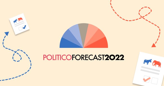
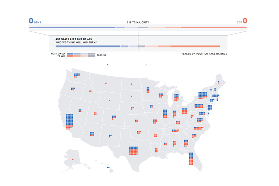
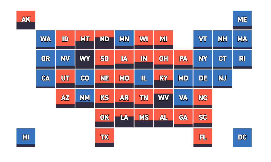
2022 Election Forecast
POLITICO predictions for the 2022 midterm races
Graphics reporter at POLITICO
Hey there - thanks for visiting!
My work has involved reporting, developing, designing, and drawing. I've spent time with organizations like the Associated Press, The Pudding, NASA JPL, Boston's Metropolitan Planning Organization, and Visualizing Impact. My academic background comes from mathematics and computer science at Cornell University. Outside of work, I enjoy training Brazilian jiu-jitsu.
Journalistic graphics and data are my main jam. My main tools are D3 and React.
POLITICO predictions for the 2022 midterm races
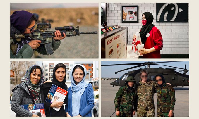
The untold story of the Afghan women who hunted the Taliban
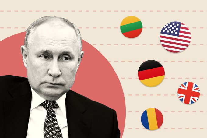
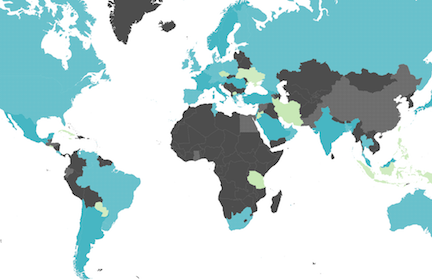
We’ve plotted 35 countries joining the EU, NATO and G-7 summits in Brussels according to their level of Russia skepticism and economic dependencies.
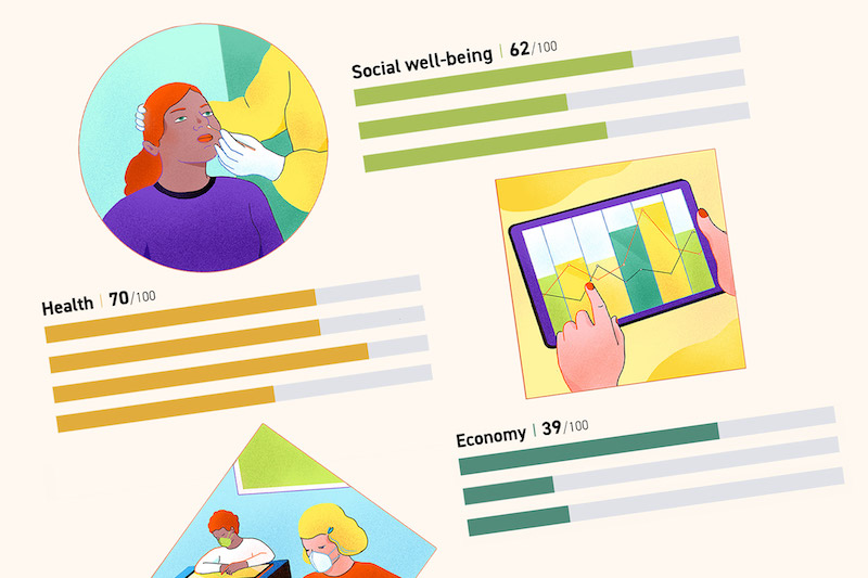
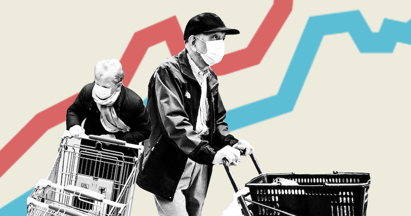
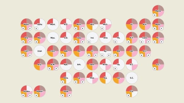
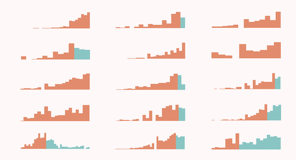
POLITICO’s State Pandemic Scorecard shows how state decisions impacted lives, jobs, education and social well-being.
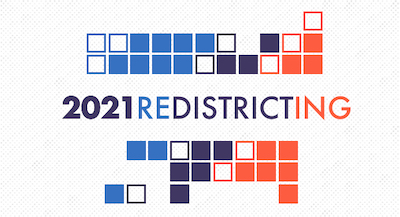
Tracker for states as their district lines change during the redistricting process
Analysis of Google mobility data during Covid-19 pandemic
Despite federal action, patchwork state laws mean hate crime reporting is spotty at best.
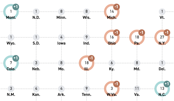
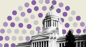
Tracking how state power shifted after the census reapportionment

U.S. policymakers have spent trillions of dollars to mitigate the effects of Covid-19. But the answer to preventing the next pandemic altogether lies elsewhere.
Design and development of data from the National Conference of State Legislatures' 2015 and 2020 demographic research.
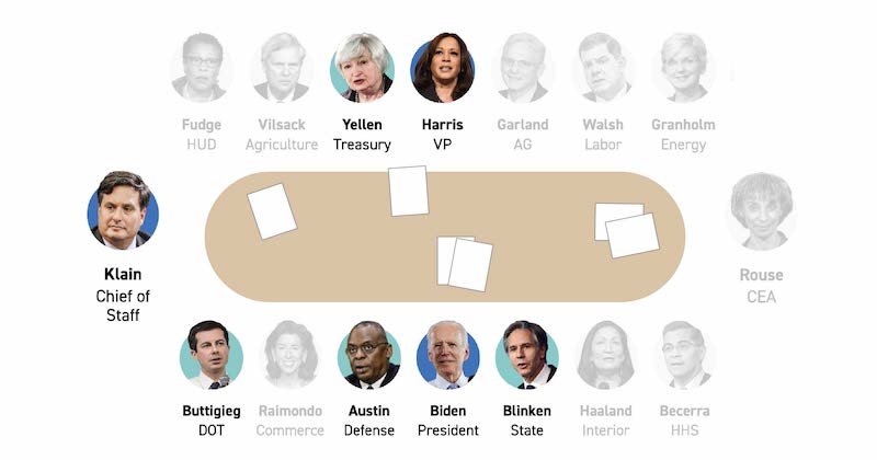
Design and development of story profiling Biden's Cabinet picks

Development of story profiling women entering the 117th Congress
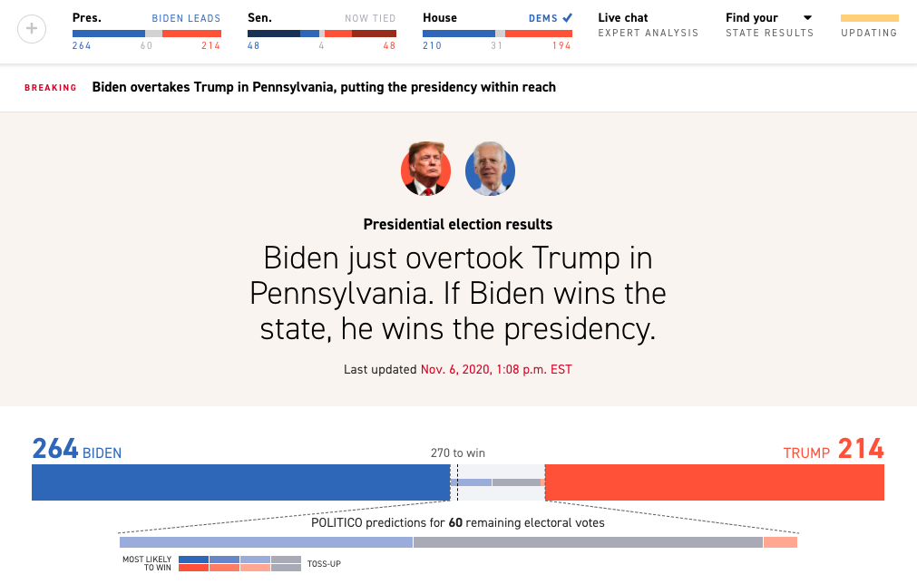
Design and development of results pages for the presidential, Senate, House, and governors races in November 2020, as well as state results pages, ballot measures, network calls, and poll closing times. Full visual portfolio on Behance.
The latest polls, ad spending and other data and analysis from 2020's key states.
Government intervention has helped keep families afloat but hasn’t resolved the larger issues with rent affordability
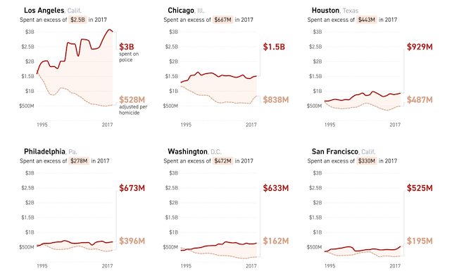
Protesters nationwide are calling to “defund the police” in the wake of George Floyd’s killing. Financial records show the opposite has been happening for years.
The coronavirus’ effect on human health has become clear. But changes to the Earth’s ecological balance — and how we relate to nature — are only now beginning to appear.
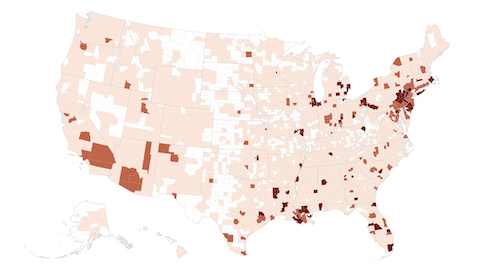
Mapping county health and demographics data against Covid-19 doubling rates
Tracking doubling rates of Covid-19 internationally
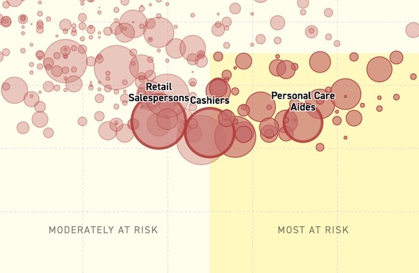
24 million of the lowest-income workersare at highest risk of exposure and make a median wage of less than $35,000 a year
Tracking tests and positive cases of COVID-19 in the US

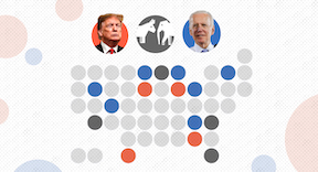
State and county shifts from 2016 to 2020
County shifts from 2016 to 2020
Tracking how many delegates candidates gain in each state
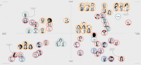
Demographic and geographical breakdown of who voted for which candidate
Scrolly-telling piece describing how caucuses work
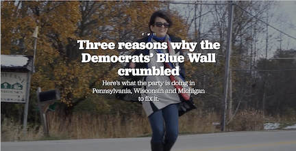
Multi-media piece on voters in Pennsylvania, Wisconsin and Michigan
POLITICO’s analysis of how senators would vote if the House impeached the president.
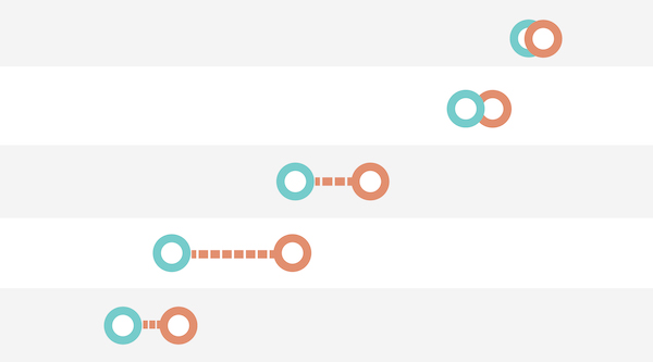
Some glowing heads on a Cartesian plane
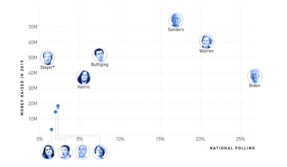
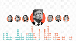
Charting candidates’ polls, money, TV, and social media numbers
Some glowing heads on a Cartesian plane
Tracking where cannabis is illegal, decriminalized, or legal
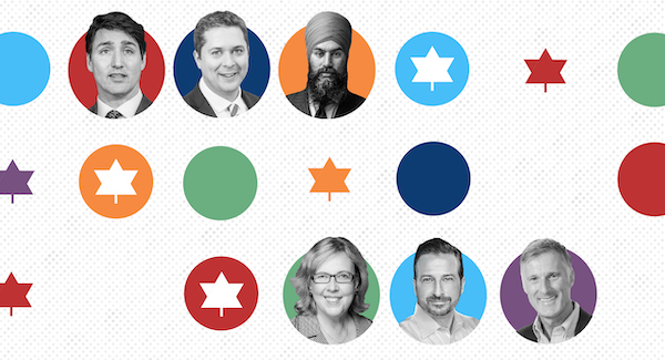
Weekly updates on the race for control of Parliament
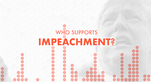
Live tracking House representatives in favor of impeachment proceedings
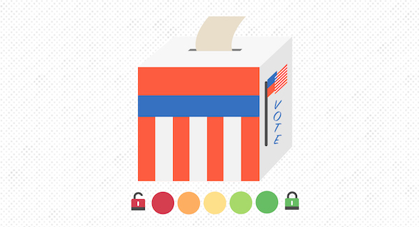
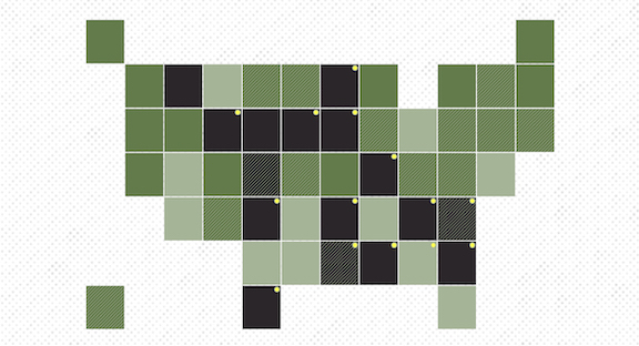
Live tracking counties and states that use paperless voting machines
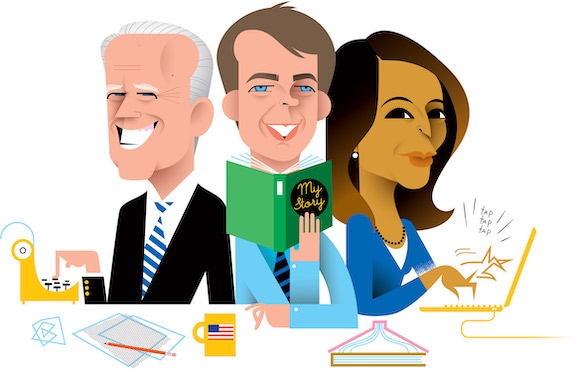
Interactive quiz and pullouts of Dem candidate memoirs

Tracking election polls on the race for the 2020 Democratic primary nomination. I wrote about building this piece on POLITICO Interactives' new blog.
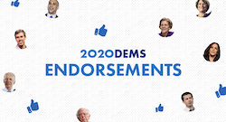
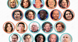
Tracking presidential candidate endorsements by members of Congress and state governors
Live, scrolly-telling interactive tracker following candidate positions on hot-button campaign issues
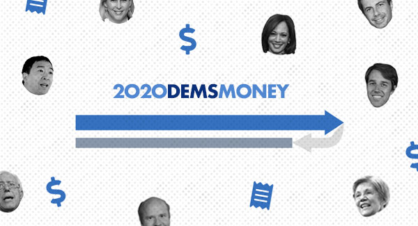
Live interactive tracker following FEC data on 2020 campaign money
Scrolly-telling interactive and forecasting tool for presidential approval ratings across demographic groups

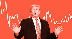
Scrolly-telling sentiment and topical analysis of 2843 tweets from @realDonalTrump
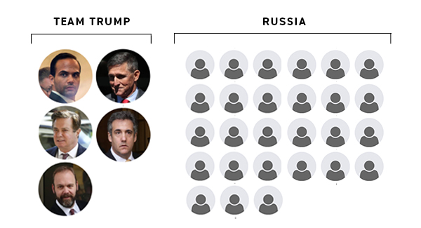
Tracking charges from the special counsel's investigation into interference during 2016 elections
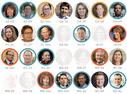
Scrolly-telling breakdown of young and diverse Congress-elects.
Design and development of data visualization modules in POLITICO's House, Senate, and state election pages.
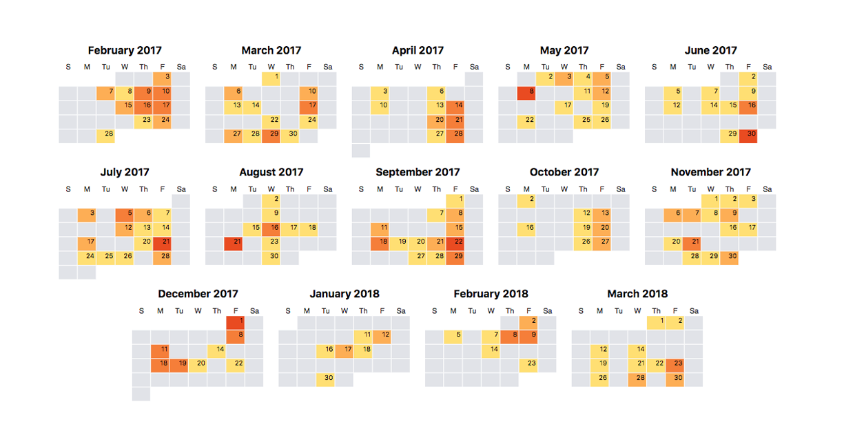
Unexplained “private” time fills long stretches of the Transportation secretary’s daily calendar
Scrolly-telling story on political divide between conservative and liberal states and growing chasm on environmental policy.
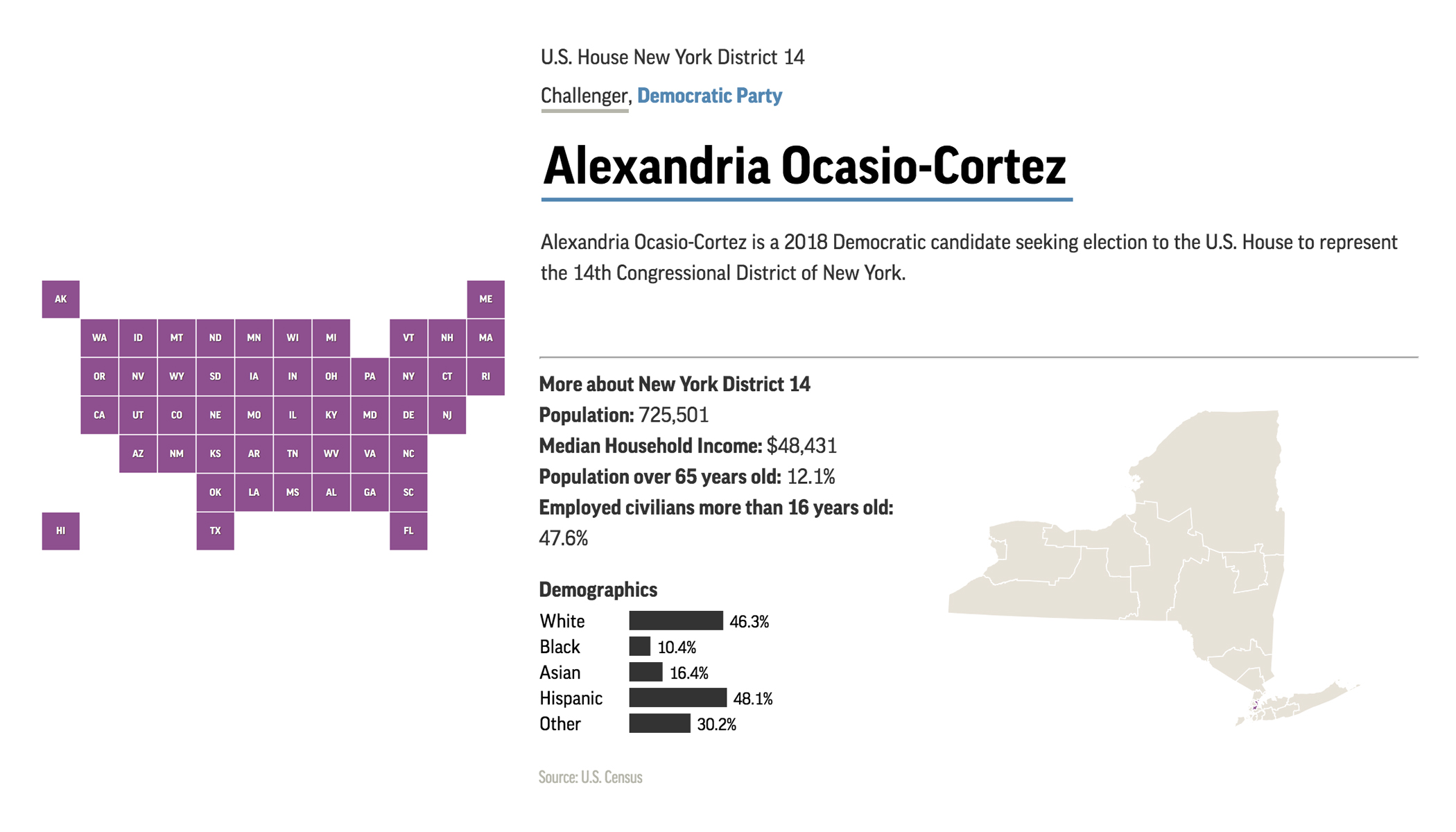
App for exploring election candidates, state and congressional district profiles
Interactive comparing access to pregnancy centers and abortion services
Visualization of body movement and changes with traditional and new firefighter harnesses
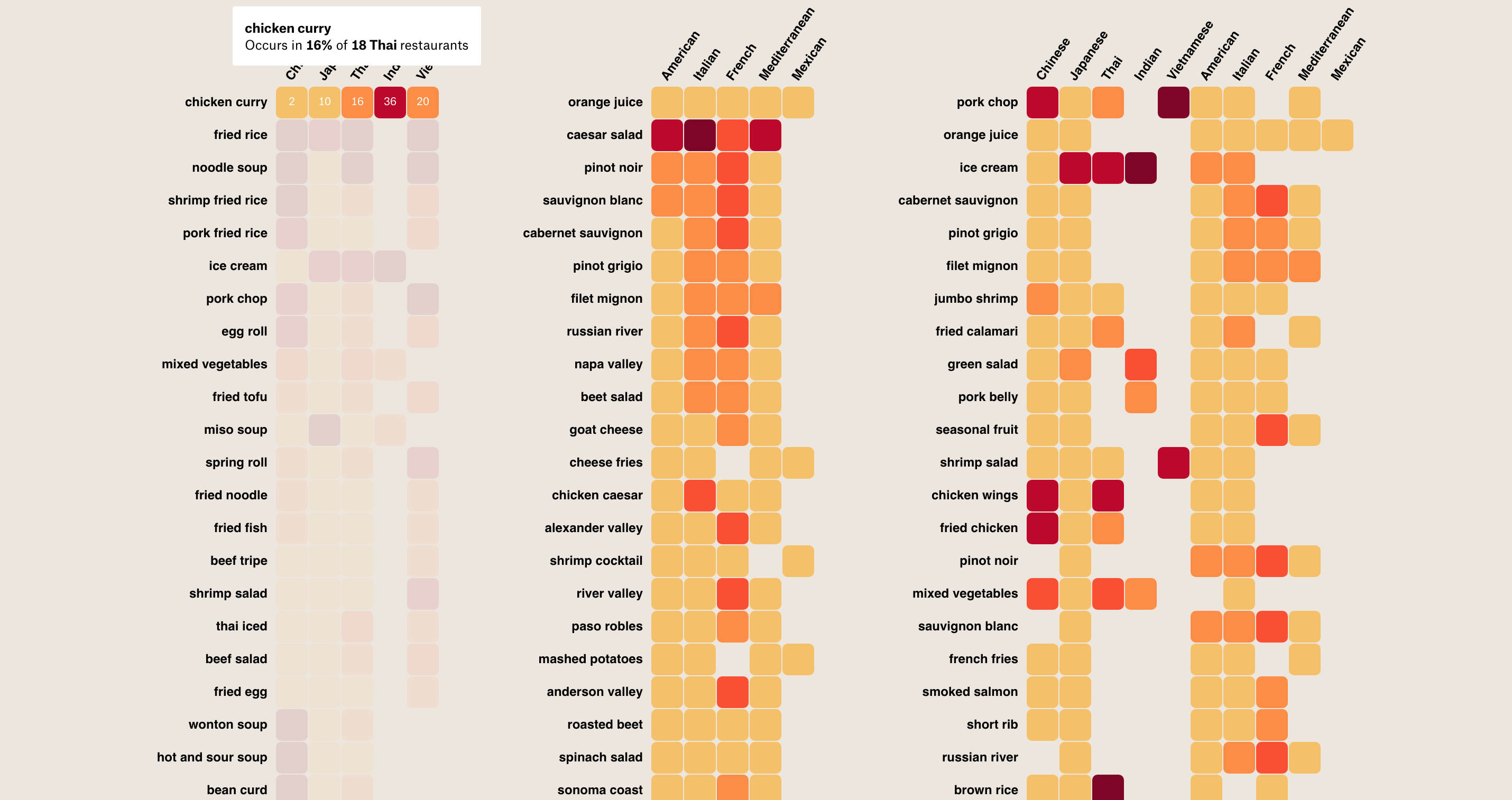
Data story on state of shared cuisines in Chinatowns, based on 693 restaurant menus in seven major American Chinatowns.
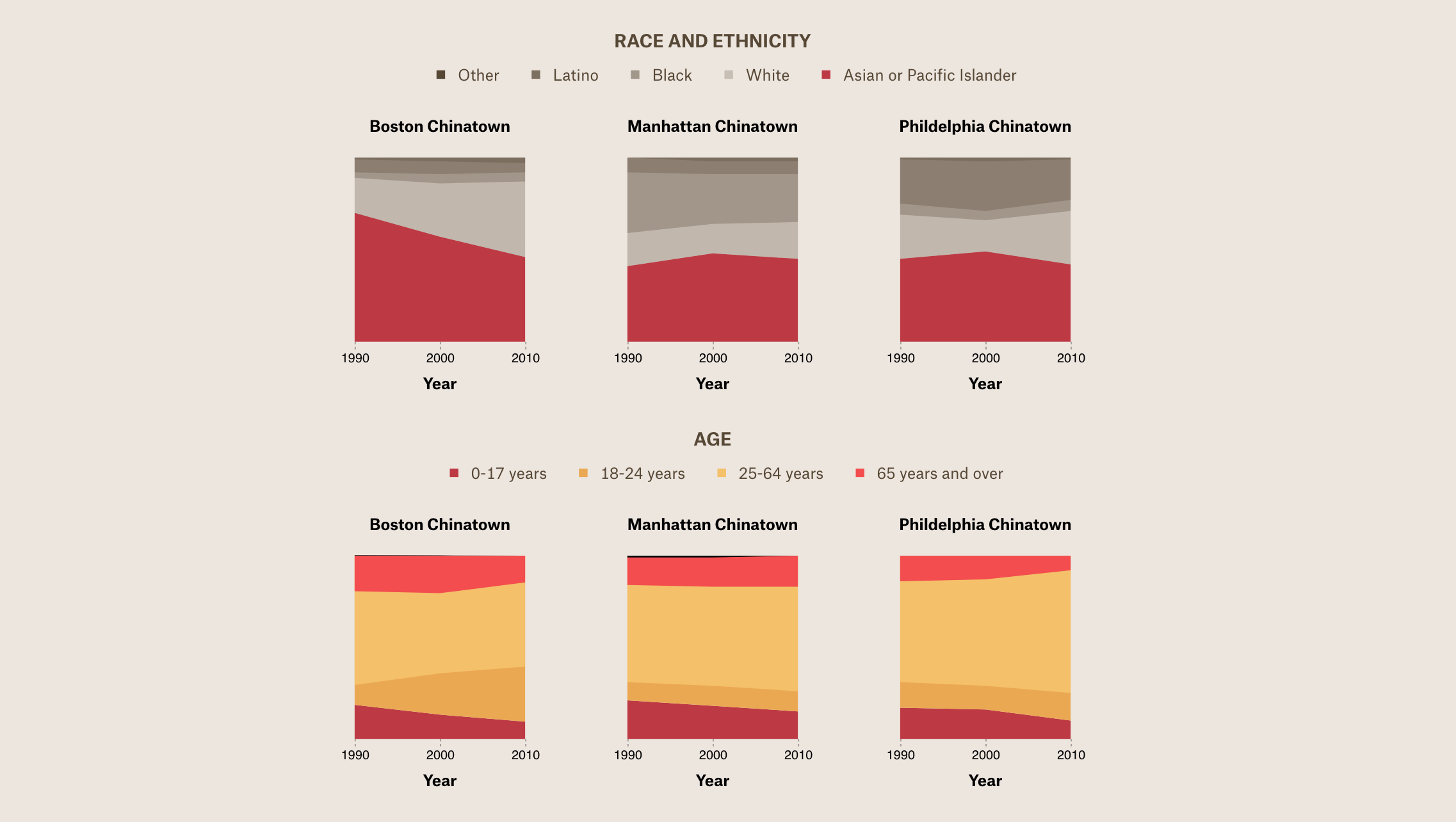
Data story on Chinatown as an ethnic enclave and tourist attraction.
Data story published with The Pudding on the legal boundaries and definitions of brain death.
Interactive report on the Cornell Daily Crime Logs. Data was "scraped" (parsed through HTML) from the university website and obtained from the Cornell University Police Department.

Interactive web-app developed with NASA Jet Propulsion Laboratory and Caltech allows users at the Meyerowitz Lab to segment 3D images of plant cells. 3D renderings are computed with the watershed algorithm and raycasted with Three.js. Planes visualized in Canvas.
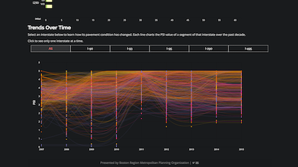
Comprehensive dashboard of geospatial and non-geospatial data visualization of transportation metrics (bike/pedestrian/truck crashes, arterial and expressway congestion, bridge condition, pavement condition, sidewalk counts, bicycle facilities, and demographics).
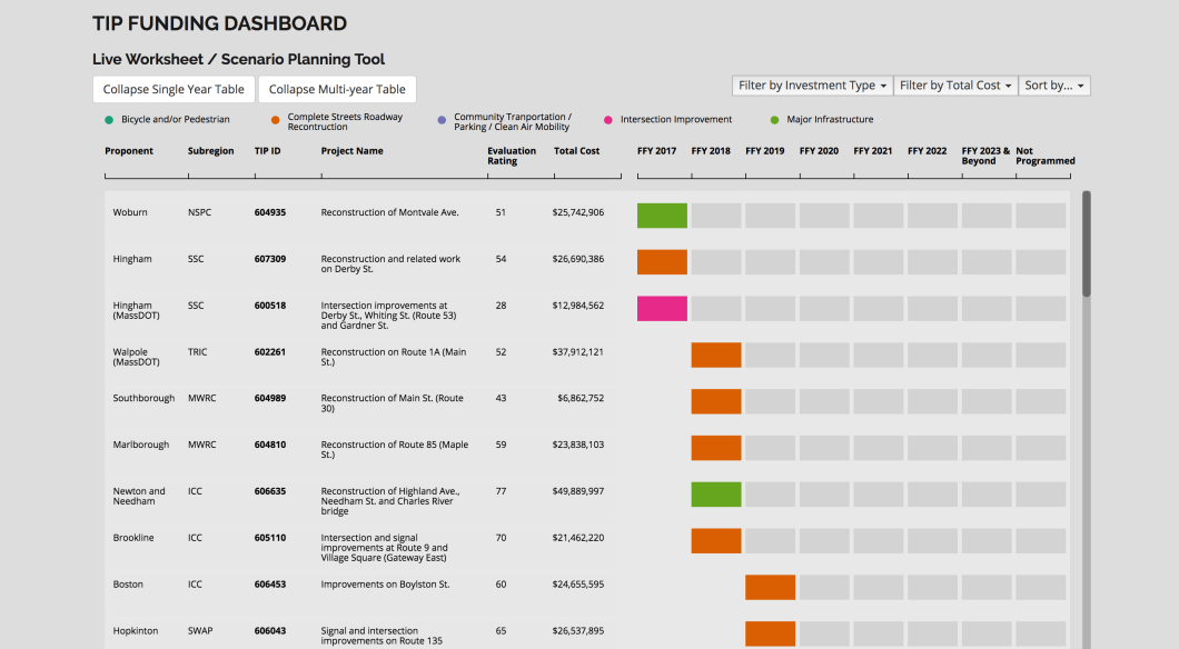
Interactive web-app developed with the Boston MPO allows users to distribute project funding and compare resulting scenarios. Visualizes each funding scenario through targets and investment category distribution.
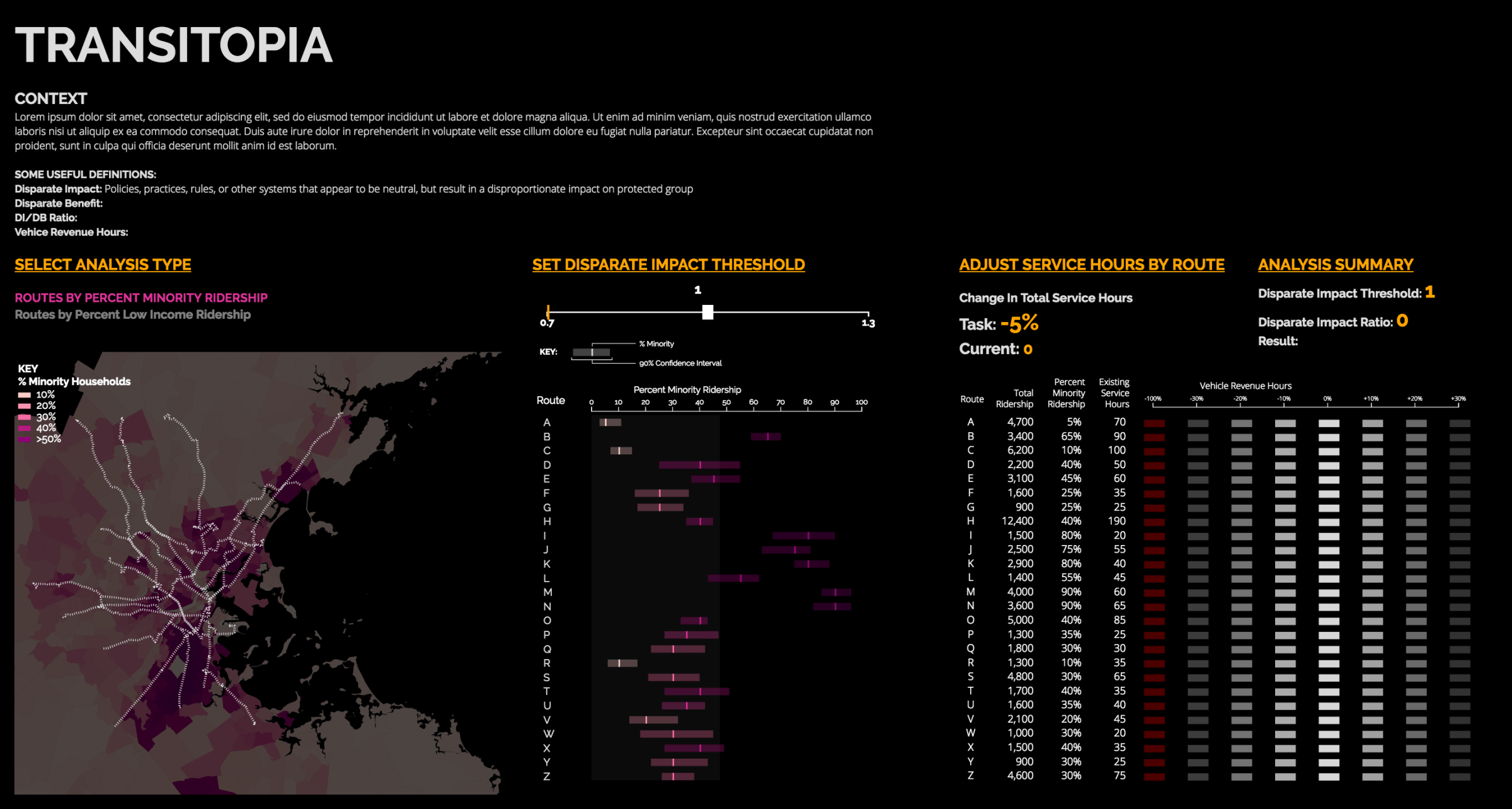
Interactive web-app exploring how funding distribution affects minority and low-income bus routes. This internal tool allows users to understand how they can minimize impact on ridership by adjusting service hours in different routes.